At ITHAKA, we’re committed to partnering with libraries and the broader academic community to leverage technology in service of a shared mission: expanding access to knowledge and education. This commitment shapes everything we do, from the projects we pursue to the everyday decisions we make in designing and developing services that meaningfully support our community.
In April 2025, we launched JSTOR Digital Stewardship Services, a next-generation digital asset management system (DAMS) that helps libraries and archives manage, preserve, and share their digital collections. The platform builds on more than three decades of infrastructure, expertise, and insights to deliver tools designed to meet today’s—and tomorrow’s—challenges in digital stewardship.
One of those earlier tools was JSTOR Forum, a predecessor to Digital Stewardship Services focused on cataloging and metadata management, including support for bulk editing to efficiently update many records at once. With a large, engaged community of Forum users, we knew it was critical not only to preserve core workflows on the new platform but also to improve the overall user experience.
In this blog post, I’ll explore how developing a deep understanding of our users’ mental models—or their internal frameworks for how a system should work—helped us redesign the bulk editing experience to serve the diverse and evolving needs of digital stewards.
Understanding the needs behind bulk editing
In earlier testing, we’d uncovered several challenges within the bulk editing experience on Forum, including overly complex workflows and slow page loading caused by the platform having to process large sets of metadata fields simultaneously.
To improve the technical performance of bulk editing in the new interface and make it faster for participants, we developed a pared-down design that aimed to increase focus on quick edits, reduce switching between the bulk editing page and the metadata records table, and minimize the amount of initial content that had to be rendered.
We knew that many of our users managed collections with anywhere from a dozen to as many as 40 or 50 metadata fields. In prior research, we had observed users struggling to locate specific fields or relying on browser shortcuts like Ctrl+F to find them.
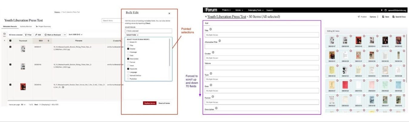
To address this, the first iteration of the bulk editing design in Stewardship allowed users to search for and select specific fields to edit—enabling faster, more focused updates across hundreds or even thousands of records. Additionally, rather than opening bulk editing in a separate page, the new design introduced a side panel for editing selected fields.
What we assumed—and what our users taught us
As we launched the first iteration of JSTOR Stewardship, I conducted moderated usability testing—facilitated sessions where participants complete tasks while we observe their experience—and solicited asynchronous feedback to test our initial assumptions.
What we learned was that our design only partially addressed users’ true needs. In working directly with participants, we uncovered a critical gap between our understanding of “bulk editing” and what many of our users conceptualized as “bulk cataloguing.” While that difference may appear semantic, it had significant implications for how users approached their work—and how we needed to support it.
Two mental models: Bulk editing vs. bulk cataloguing
Through our research, we identified two common use cases that reflected distinct ways librarians and archivists edit metadata in batches—each shaped by their mental models and collection needs.
- Targeted bulk editing: Some users only needed to edit one or two metadata fields shared across items in a collection (e.g., a rights statement or date). For them, the ability to search for and select only the metadata fields they needed was a valuable feature that helped focus attention, remove noise, and prevent the accidental editing of an unrelated field.
- Context-rich bulk cataloguing: Other users preferred to see the entire cataloguing form—not just selected fields—so they could refer to and understand the full context of the items they were editing. Even fields they didn’t intend to change offered valuable context, helping them spot and correct metadata errors or inconsistencies across all fields.
Each group had legitimate needs that stemmed from their mental models and institutional workflows—neither approach was right or wrong. This insight was pivotal in shaping what came next.
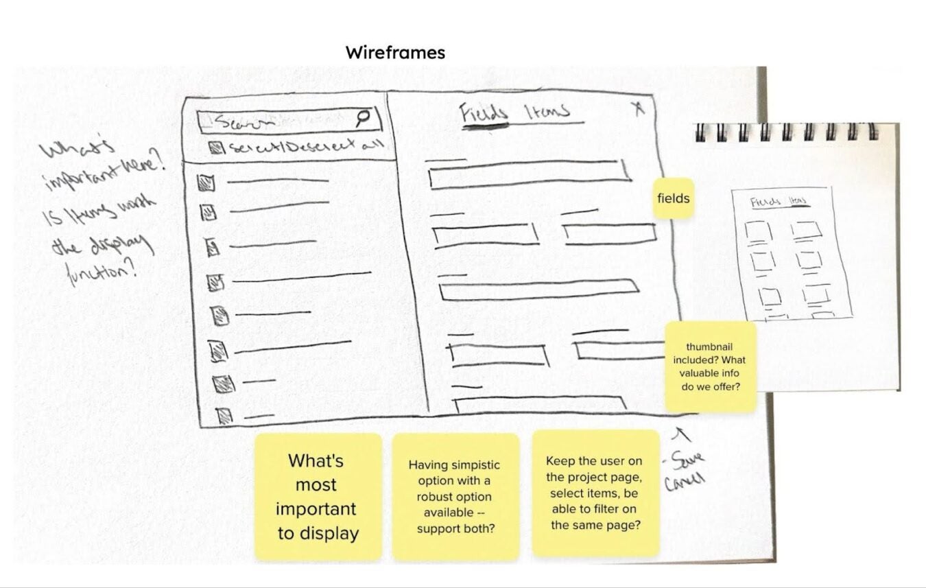
Design iteration in practice: Listening and evolving
Seeing the experience through the eyes of users and grasping their mental models helped us recalibrate our assumptions.
If editing and cataloguing hundreds of items at a time were core tasks, then collapsing the bulk editing experience into a side panel was no longer viable. Indeed, a consistent piece of feedback across all users was that the more compressed workspace created anxiety about losing visibility into key metadata fields.
To address these concerns, we broadened our view of the problem and reframed it from the user’s perspective. We focused the next phase of testing around questions such as:
- Under what conditions do users bulk edit their collections?
- What do they need immediate access to when bulk editing?
- What is the user looking at and looking for when they decide to bulk catalogue?
- What does success look like?
- How do they rectify problems and errors when bulk editing and what are the gaps in what they are able to do?
These questions helped center user needs in each design decision and iteration.
What changed: Key improvements in the bulk editing experience
User feedback led to three critical updates that addressed both performance and usability:
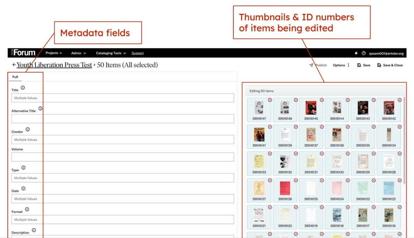
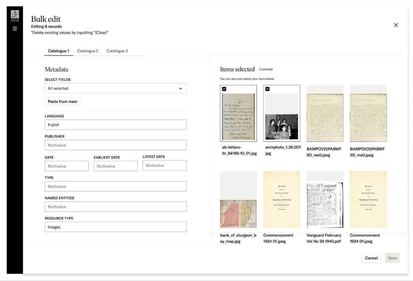
- Expanded layout: The earlier side panel design was expanded to a full-width sheet that still avoids page navigation, preserving the performance benefits while adding needed space.
- Field visibility by default: All metadata fields are now visible by default, with the option to show or hide individual fields.
- Item thumbnails: Thumbnails now appear alongside items being edited, allowing users to identify records and select subsets without leaving their workflow.
These updates addressed both mental models—offering clarity, flexibility, and confidence regardless of how users approached their work.
Designing with values: Evidence, trust, and belonging
Every user research session and participant conversation deepens our collective understanding of how digital stewards think, work, and adapt.
In this case, our iterative development process transcended our initial aim of fixing performance issues and brought us closer to our values at ITHAKA: evidence, trust, teamwork, speed, and belonging.
Designing for these values means listening to our community, honoring the complexity of their work, and evolving our tools to meet their real needs—not our assumptions.
To learn more about how JSTOR approaches digital stewardship and supports institutions in this work, explore our Stewardship services. For resources designed to support Forum participants transitioning to Stewardship, visit our dedicated guide.