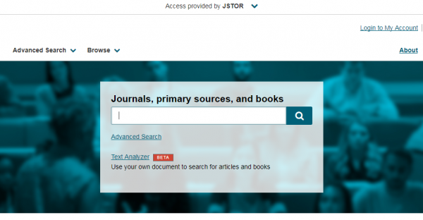
You may have noticed that JSTOR has become easier to use. That’s because we recently rolled out a new visual design that enhances the searching and browsing experience, and clarifies access options. The functionality you’ve come to expect remains the same, and the redesigned interface now features:
- A search box at the top of every page to help you find the content you need
- Larger fonts, brighter color, and navigation aids to provide a consistent experience
- Optimized headers and footers to make it easier to explore JSTOR’s content and information
- Clearer identification of your institutional access provider
We also updated our logo! The JSTOR logo has been modernized to better suit the variety of digital environments in which you interact with us, including all our sites and services, as well as social media.
We spent several weeks testing and refining this design with students and faculty. Our ultimate goal is to advance your research experience through a more consistent design across all your interactions with JSTOR. Try the improved design now.