Persuasive Cartography: The PJ Mode Collection is a physical and digital open access collection of maps donated to Cornell University Library’s Rare and Manuscript Collections. This collection brings together maps from many eras from all over the world to explore their power as visual messengers.
Following up on our interview in which he shares the origin of the collection, collector and donor PJ Mode shares a selection of his favorite pieces.
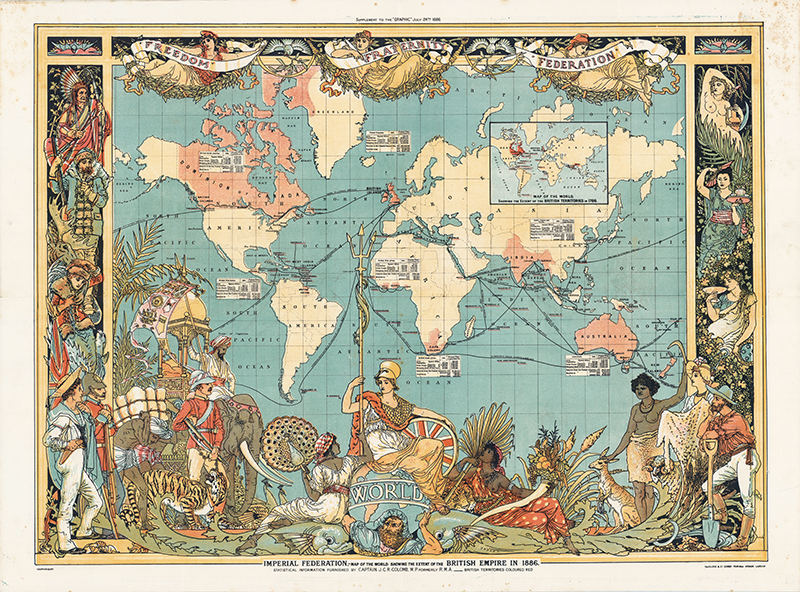
The Imperial Federation League map was published at the time of the Colonial and Indian Exhibition in 1886, “a showcase for the wealth and industrial development of the British Empire.” It is “dated just before the Queen’s Golden Jubilee in 1887,” and “reflects the celebratory consciousness of Victoria’s Empire.” (Biltcliffe 2006, 65).
“The map is the perfect symbol of the state.” (Monmonier 1991, 88). In many ways, this is “an excellent candidate for the quintessentially imperial map. It seems to encapsulate the culture of high Victorian imperialism in a single iconic image conjoining the infrastructure of empire (represented by the statistics of trade and by the lines connecting major ports of call) and imperial fantasy (especially the use of statuesque human bodies, flora and fauna around its crowded margins to denote whole continents, races and landscapes).” (Driver 2010, 149; see Biltcliffe 63-64). The late Brian Harley, the intellectual leader of cartographic “deconstruction,” wrote that “As much as guns and warships, maps have been the weapons of imperialism” and he used this map to illustrate the point! (Harley 1988, 282, 283).
But further analysis suggests a more complex picture. Although the map cites the author of its statistical data, it does not (surprisingly) name the map maker. As a result of an outstanding recent paper, we now know that the map was prepared by a well-regarded illustrator of the time, Walter Crane. The work matches his distinctive style, and the lower left corner of the map bears his tiny mark: a crane and the initials W. C. (Biltcliffe 64-65). The failure to credit Crane was no doubt a result of his politics: he was “a leading figure in the socialist movement” (Menges 2010, x), and for years contributed weekly cartoons to the leading movement periodicals, Justice and Commonweal, “glorifying the cause of Labour, or protesting against the tyranny of Capital.” Konody 1902, 82; see Biltcliffe 65; Driver 152.
In many ways, Crane had the last word. A “particularly striking feature” of “Freedom,” “Fraternity,” and “Federation” at the top of the map “is their headwear, distinctly reminiscent–at least to those who cared to read the symbolism–of the red Phrygian cap worn by liberated slaves in ancient Rome, which was adopted as a French revolutionary symbol of liberty and widely used as an anti-colonial icon in the nineteenth century.” (Driver 151; Barron 2008, 14). And while Britannia sits astride the world as always, and Atlas carries the world on his shoulders as always, there is a novel sash across his chest, reading “Human Labour”!
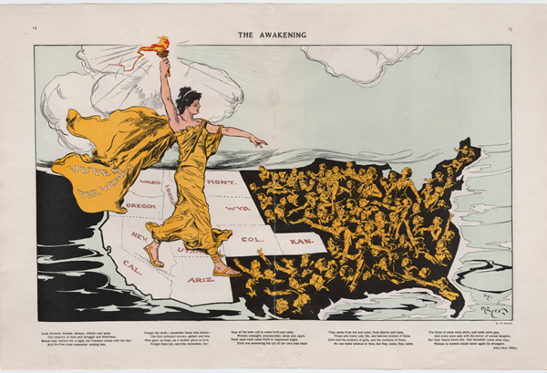
The most striking of the “suffrage maps,” which played a major role in the successful fight for women’s suffrage in the U.S. Lady Liberty, wearing a cape labeled “Votes for Women,” stands astride the states (colored white) that had adopted suffrage. She holds aloft her torch, bringing “enlightenment” to women in those states still in the dark. The faces of these women are turned up to the light, and some reach out in hope. (Many have fashionably short hair and hats, reflecting the middle and upper-class core of the suffrage movement. Dando 2010, 224). This map appeared in the magazine Puck during the Empire State Campaign, a hard-fought referendum on a suffrage amendment to the New York State Constitution. The referendum failed in 1915 but was successful two years later.
The illustrator was Henry “Hy” Mayer, a German-born artist who was Puck’s chief cartoonist at the time this was published. Kahn 2014, 322. Below the illustration is a poem by Alice Duer Miller, a novelist, playwright, screenwriter, member of the Algonquin Hotel Round Table and “popular poet of tremendous range and skill.” Chapman 2003, 1. Miller was an active and tireless feminist who produced a substantial volume of “defiant, witty suffrage verse.” Ibid. 3.
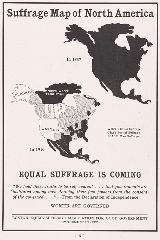
An advertisement promoting the woman’s suffrage movement prominently displayed on page 3 (following the ad for Tiffany’s!) of the freshman “facebook” published in 1916 for the Harvard Freshman Class of 1919. The map contrasts the situation in 1837, when women could not vote anywhere in North America, to the multiple U.S. states and Canadian provinces that allowed at least partial suffrage in 1916, concluding “Equal Suffrage is Coming.” Quoting from the Declaration of Independence that governments derive “their just powers from the consent of the governed,” the advertisement concludes, “Women Are Governed.”
The timing is particularly interesting because the year when this freshman class graduated, 1919, is the year in which Congress enacted the Nineteenth Amendment and sent it to the states for ratification.
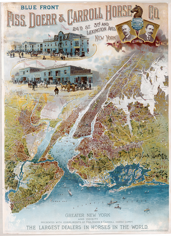
This striking, late 19th-century map/poster of New York was created as a promotion for the Fiss, Doerr & Carroll Horse Company, the self-styled “largest dealers in horses in the world.” Above the map are renderings of the company’s trademark “Blue Front” buildings, the “Retail Department,” and the “Auction Department,” located between 23rd and 25th Streets and Lexington and Third Avenues, along with portraits of President J.B. Doerr and Treasurer J.D. Carroll. The map is a bird’s-eye view, very much in vogue at the time, with the company’s Kip’s Bay location at the epicenter. The poster was produced by the distinguished American chromo lithographer Julius Bien in 1897.
We have an unusual amount of printing history concerning this map because a writer for Printers’ Ink, waiting at an elevated train stop, “was attracted by the poster of the Fiss, Doerr & Carroll Horse Company, so much in evidence” and secured an interview with Joseph Carroll in March 1897. Carroll said that the company and its predecessors had been in business at the same site for 32 years and that the company sold an average of “not less than about 900 horses weekly” in its auction sales alone. Schwartz 1897, 10.
In response to questions about the firm’s advertising, Carroll reported that the company’s experience had “made us the very staunchest advocates of publicity.” Discussing future plans, Carroll said that $4,800 (about $135,000 in 2016 dollars) “will be devoted this year to a map of Greater New York, together with pictures of the company’s buildings, and portraits of the firm’s members. This is said to be the most accurate map of Greater New York thus far published. The plate, which is in 18 colors, cost $3,000; 25,000 copies of it are to be distributed among our customers and business houses, framed and covered with glass.” Ibid. While certainly not “the most accurate map of Greater New York thus far published,” it is nevertheless among the most attractive. It seems unlikely that 25,000 copies were distributed–let alone framed and glazed–because neither the dealer who sold this copy to me nor I have been able to locate another.
In about 1902, the company published a 72-page promotional book, “To Our Customers and Friends.” Among other things, this work described a recently-added “high class coach horse stable” adjacent to the firm’s Forest View Stock Farm in Westchester County, and a brand new “trotting horse department.” Formal photographs are provided of the company’s officers and employees, along with various facilities at the Kips Bay headquarters, the “Export Barn” (on the Hudson at 36th Street) and in Westchester. There are scores of advertisements for carriages, harnesses, sleigh robes, blankets, horse rubs, colic cures, hay, and feed, etc. The text extols the strength of the American horse market (“it is pre-eminently the age of the horse”) and the “far-reaching and ever extending influence of America’s greatest horse-dealing firm, the Fiss, Doerr & Carroll Horse Company,” with sales of “as many as 600 horses… in one day.” By 1907, the company had expanded further with the completion of a seven-story stable on East 24th Street linked by ramps and passages to a grand new auction building. The auction market was “an exuberant mixture of Roman classicism and Beaux-Arts grandeur,” with a limestone facade and “high, arched attic windows.” It enclosed a huge interior auction space, 65 by 197 feet, with accommodations for up to 1,000 spectators under a steel arch roof and a “suspended, coffered ceiling.” Gray 1987.
Alas, the “age of the horse” was already beginning to yield to the automobile age. In April of 1907, “A Journal for Those Employing Commercial Motor Vehicles” reported “an event… which strongly fortifies the faith of those who believe that the vast bulk of city merchandise will soon be carried in power wagons. The largest and most influential firm of draft animal dealers in the world–Fiss, Doerr & Carroll, of New York City–realizing that further opposition to the commercial motor vehicle is both futile and hazardous, has decided to espouse its cause and sell motor trucks in the market it so thoroughly dominates through its horse sales… No more notable conversion than this has occurred in the brief but brilliant history of the motor wagon.” The Power Wagon 29:3, April 1907. By 1928, Fiss, Doerr was no more, and the R&T Garage Company purchased the elegant Beaux-Arts auction mart. Gray 1987.
Lithographer Julius Bien (1826-1909) is best known for his chromolithographic, elephant folio edition of Audubon’s Birds of America. “In the 1860s Bien began to specialize in the production of lithographed maps and charts. For the rest of the century, he produced maps for nearly all the major American geographical and geological publications and for the decennial census reports. Bien developed new coloring and shading techniques was an early user of photolithography, and was instrumental in establishing scientific standards for American cartography.” Last 2005, 36-37.
Portions of the foregoing courtesy Michael Buehler, Boston Fine Maps.
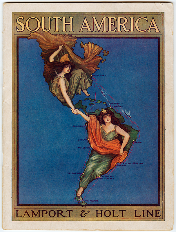
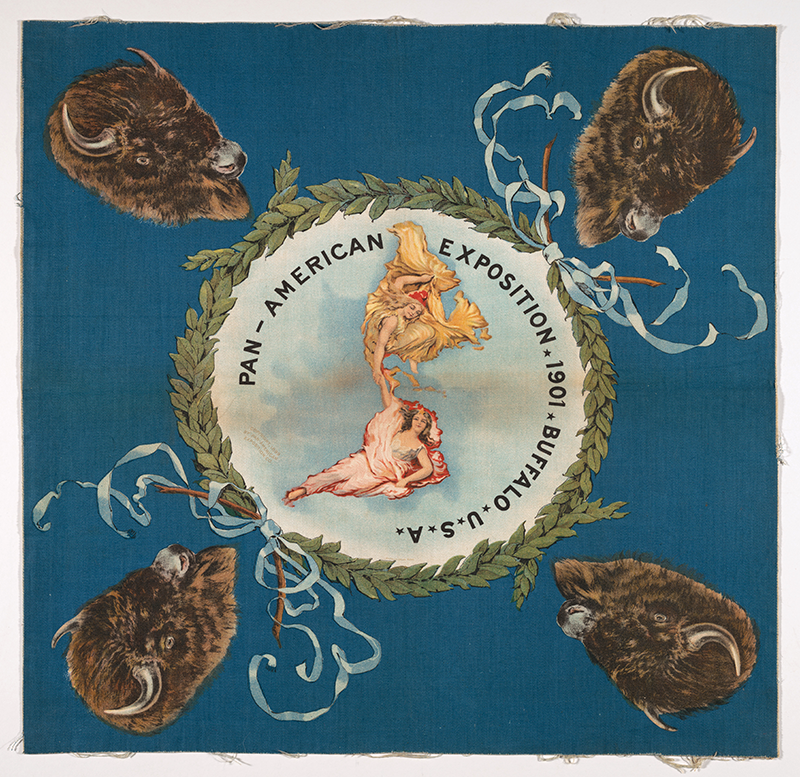
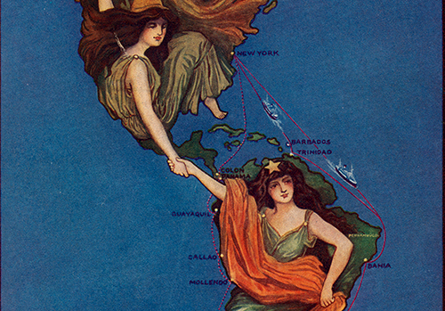
The advertising brochure (left) appropriates the logo map of the 1901 Pan-American Exposition in Buffalo without attribution.
Over 400 entries were submitted in a competition among artists to design the promotional logo, or seal, for the Exposition. The winning design was submitted by Raphael Beck, an artist from Lockport, NY, with a studio in nearby Buffalo. His elegant design featured North and South America in the shape of two women in flowing dresses, locking arms across Central America. The models were selected in a contest by the New York World to find “the most representatively beautiful women in America” from hundreds of entrants. The two winners were Maxine Elliot (“too well known as the most beautiful woman on the stage to need further introduction to the public”) and Maude Coleman Woods (“honored as the leading beauty of Virginia, her native state, by the Daughters of the Confederacy”). Lockport Union-Sun, December 4, 1900, http://panam1901.org/panamlogo.htm, accessed April 21, 2016.
While the Exposition Committee had originally intended to use Beck’s design “only for dignified purposes,” it proved so popular and profitable for the Committee that its use was eventually allowed not only in booklets, folders, and circulars, but on 3 x 5 cards in English, Spanish, French and Portuguese, 9-inch hangers, paperweights, pins, decks of cards, clocks, pillow covers–“everything that didn’t move and some things that did.” Profitable Advertiser, June 1901, ibid; http://alchetron.com/Raphael-Beck-1199041-W, accessed April 21, 2016.
A remarkable polemic map on the back of a 1922 electric bill! The Los Angeles Aqueduct–world’s longest at the time–was completed in 1913 by the legendary superintendent William Mulholland. http://www.history.com/topics/los-angeles-aqueduct, accessed March 20, 2016. The aqueduct brought ample water from the Owens Valley on the Eastern side of the Sierra Nevada mountains, not only for the massive growth of the city but for the San Fernando Valley as well. The map identifies the “source of the City’s water supply” at an elevation of 3,800 feet in the “snow-covered Sierras” and shows a bird’s-eye view of the 250-mile course of the aqueduct “to faucet” in Los Angeles.
Text on the map explains to customers that their bills (which had presumably increased) were necessary because of the cost of the aqueduct system, over $50 million (roughly half a billion 2016 dollars), as set out in detail. It also provides data showing that water rates in Los Angeles were roughly equal to the average rates in other large US cities. (Note: In 1922, the Los Angeles Department of Public Service consisted of two units, Mulholland’s Bureau of Water Works & Supply and the Bureau of Power & Light, which sent this bill. I’m unaware of whether similar maps were included with water bills.)
For full details on references, visit
persuasivemaps.library.cornell.edu/content/references
