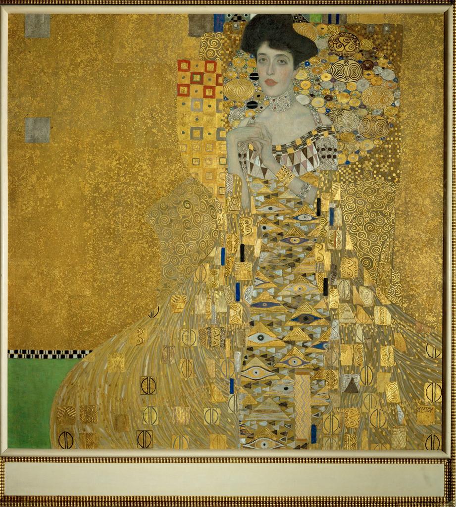
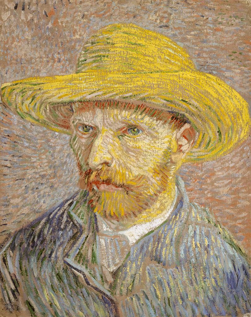
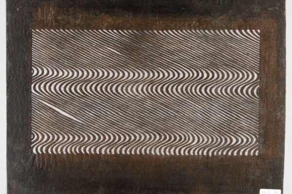
One of the most daunting challenges I faced teaching in a high school art program was developing a common language to articulate the principles and elements of design. Helping students hone those communication skills made critique easier but took a lot of time up front. When our faculty began to use the same terminology across the curriculum, students developed a comfort level with those terms and began using them more naturally in discussing their own work and the projects of their peers and heroes from the art world.
Long before I knew I was going to be building resources for teachers in Artstor, I was gathering images to help my own students “see and say” what they noticed in a work of art. My goal was to get them to articulate what principles were in effect and what elements supported those principles. After about ten years, I had a pretty robust image group to use for each. When I came to Artstor, I was determined to make ten functional groups of fewer than 24 images that other teachers could use to highlight specific elements or principles. I added favorites that colleagues suggested and included term definitions. Now, with Artstor’s alliance with JSTOR, I can also include further reading about teaching Art and Design. These groups can be found in Teaching Resources under Studio Art. My approach is but one of many; since an image group can be copied and then altered as needed, we thought it might serve as a valuable starting point for studio teachers.
The Elements of Design
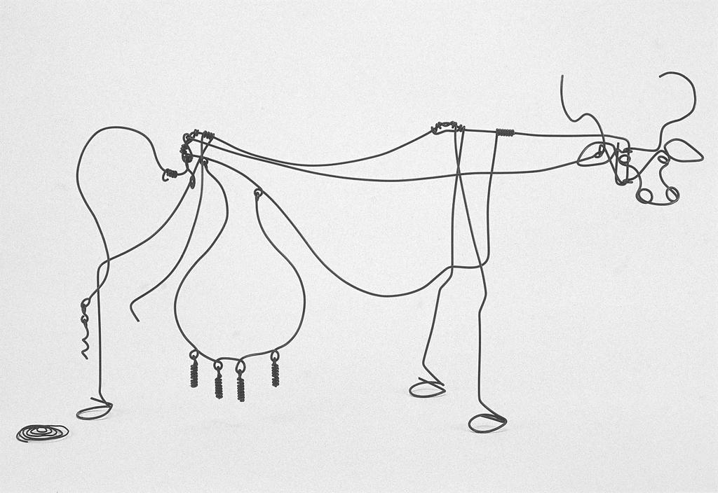
The first group I always used on the first day of school is Line in Art and Design. Beginning with the linear work of prehistoric cave artists tends to ground students in the idea that making and enjoying art has long been an essential element of being human. Showing both the whimsical wire sculptures of Alexander Calder and the Tughra of Sultan Sulaiman the Magnificent underscores that line is the most of the universal of all art elements.
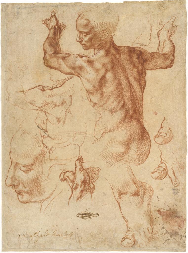
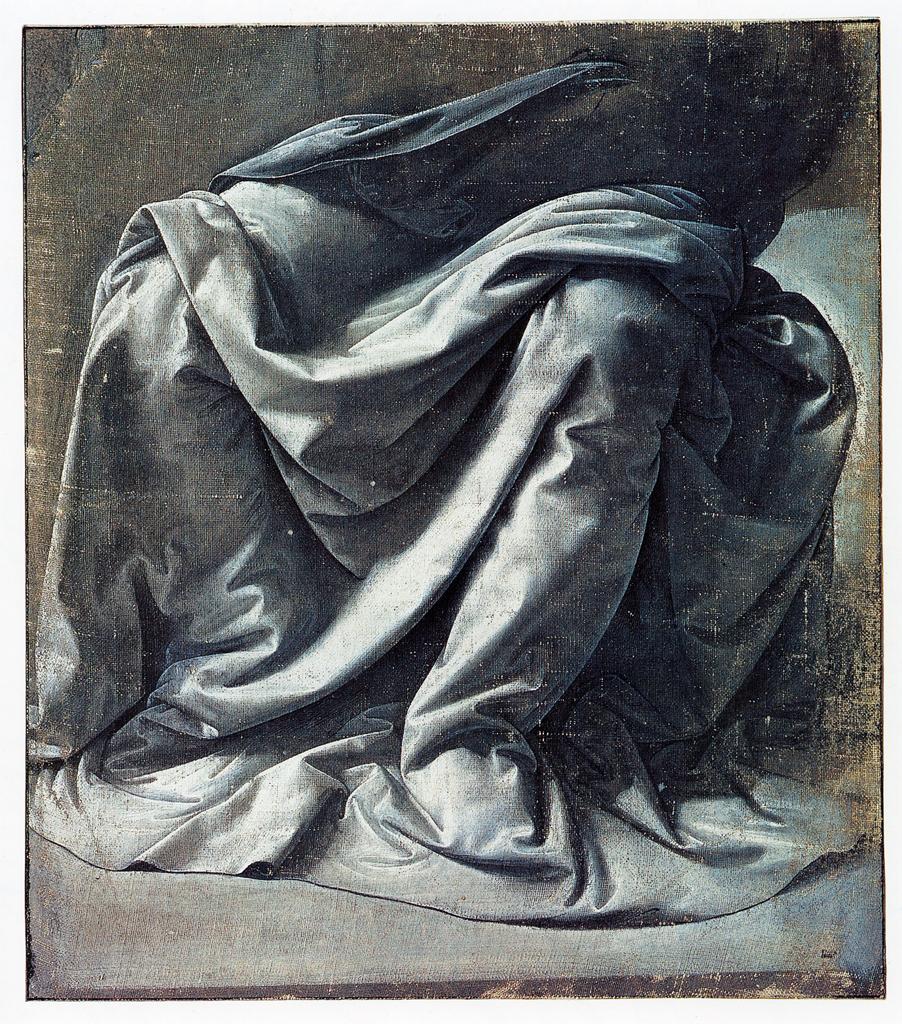
From Line, I moved on to Value in Art and Design. Drawing is one of the first tools that an art student uses. Sharing the studies of some of the world’s greatest renderers when discussing value structure can be an inspiring way to remind them that, through drawing, they are speaking a language that their artistic ancestors have used. The work of the legendary teacher of these principles and elements of design, Josef Albers, is useful because his Gray Instrumentation series clearly illustrates the effect of value changes in perception of depth.
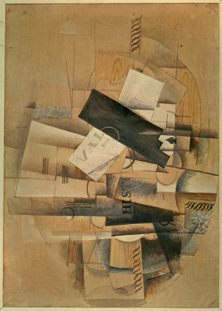
As students began to differentiate between Shape, Form, and Volume in Art and Design, the compelling issues of positive and negative space naturally emerged. We simplify this idea here and expand on it later when we address the Principles of Design. Over the years, I have found experiencing the three-dimensional work of Louise Nevelson, such as City-Sunscape, helps students better articulate their understanding of spatial ambiguity that is also found in the layering of shapes that László Moholy-Nagy or Kazimir Malevich employed in their two-dimensional work. Teaching shape, form, and volume in one unit also invites students to explore architecture and sculpture.
Texture in Art and Design is especially fun to teach with the Artstor Digital Library because of the zoom feature. The implied or visual texture of Ingres’ Napoleon on His Imperial Throne juxtaposes nicely with the impasto of Vincent Van Gogh’s The Starry Night. Students respond with the best possible facial expressions when exploring Object (fur covered cup) by Meret Oppenheim. I have often done this unit using Artstor live rather than Powerpoint download just for the flexibility that the image viewer provides.
The final lesson on the elements is usually the most daunting for students. Color in Art and Design merited a detailed essay covering the vocabulary terms associated with color. Also, links to a couple of Khan Academy videos on color were included along with the JSTOR essays we have chosen for all these groups. A work of art that has often helped my students understand the properties of color is Green and Orange Flag by Jasper Johns. In addition, several diagrams in the Artstor Digital Library have helped me teach color to my emerging artists. Having access to so many of these supports some differentiated learning. Diagrams published by Duane Preble and Farber Birren unlock the spectacular works that explore color by Gene Davis and Thomas Downing.
Establishing a clear understanding of the elements with students becomes the scaffolding for the core principles of art and design. Practicing artists return to these elements again and again for affirmation, problem-solving, and inspiration. In part two of this post, I will share one approach to applying those principles to the elements with young artists.
In my next post, we’ll look at the principles of design.
— Dana Howard, Senior K-12 Relationship Manager

